|
|
Post by koolbraider on Jan 7, 2014 11:05:57 GMT -6
Since number 5 was out I started with simple editing of the four remaining pics. It took me a bit to figure out how to keep the numbers in each pic. Fortunately PSE 7 allows you to draw square selections and work inside or outside them. Here's what they looked like first; 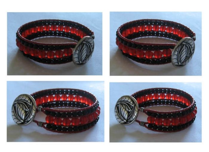 Pretty blue and dark. So, with a color cast correction (like instant white balance) and lightening up, here's what each looks like now. You can see the blue background around each number. 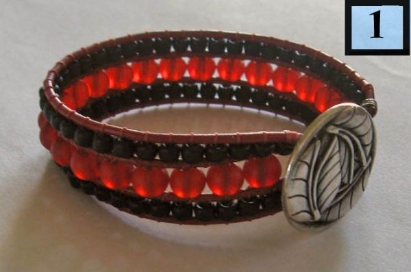 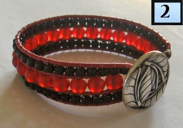 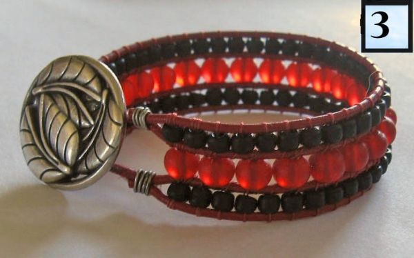 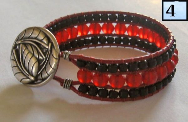 After color cast correction and a bit of lightening I saw that 1 and 4 look at bit blurry. 2 and 3 look good but the silver button on 3 looks a bit yellow. As for those wires I'm not sure if I like them showing but they are part of the bracelet and a customer would want to see everything, no surprises. I also note that there seems to be a thread or something over the top leather band in 3 and 4 that will need to be removed. Honestly didn't see it while taking the photos. (Side note: have seen some very dark recent Etsy photos that could benefit from editing. And there are a couple of good tutorials on Light Stalking that are a bit over my head but I might post them here as soon as I understand them.) Next: more work with light values: brights, midtones, and shadows |
|
|
|
Post by Sophy on Jan 7, 2014 15:15:52 GMT -6
2 and 3 do look good. I see a bit of yellow on the buttons in all of the pictures, so maybe that is just the way the button is?
|
|
|
|
Post by caeterle on Jan 7, 2014 22:01:53 GMT -6
Or it could be from the lamp?
Even clothing can change the hue if it's too bright. The other day I had "I AM SHERLOCKED" from my t-shirt all over some shiny piece pictures!
|
|
|
|
Post by Michele on Jan 7, 2014 22:47:53 GMT -6
Sue, I like pic 2 the best. Or it could be from the lamp? Even clothing can change the hue if it's too bright. The other day I had "I AM SHERLOCKED" from my t-shirt all over some shiny piece pictures! I have a neon flamingo in my office close to the window where I take pictures. I have to unplug it, especially if I'm taking pics of silver. I was getting tiny flamingos in the middle of the silver.  Attachments:
|
|
|
|
Post by koolbraider on Jan 8, 2014 10:41:59 GMT -6
Michele, don't tell me you left out the leg lamp???
Seems I'll be working on 2 and 3. The button is silver but my camera often puts a yellowish hue on silver for some reason. Read that on Digital Photography School; some cameras will add a particular overtone. My little Casio made everything green.
(I can hardly wait for the new season of Sherlock.)
|
|
|
|
Post by rocknwow on Jan 8, 2014 14:37:37 GMT -6
I just wanted to say I read these. Thanks.
I wanted to know what beads are in the bracelet...I love it.
|
|
|
|
Post by caeterle on Jan 9, 2014 11:23:27 GMT -6
1. I can't wait, either. No spoilers from you Americans, please!!
2. When my first camera was on the brink of death, it gave everything a lovely lavendar shade ...
3. What you said about the Etsy pictures ... it's amazing how different pictures look on different pages. I always make mine rather on the dark side because Zibbet and FB and some others like to wash them out a bit. Also it depends so much on the individual screen you are seeing them on! I can tell when I look at my items on my sister's laptop.
Sometimes it's hard to know if someone is not getting it or just not seeing it himself.
|
|
|
|
Post by koolbraider on Jan 9, 2014 13:06:53 GMT -6
Kevin, these are 6mm round beach glass beads. When you hold them up to the light they look like little red jewels. The red leather is not quite the color shown here but the rounds are spot on for color (nice English turn, huh?).
Cat, I have read that monitors need to be "calibrated" by some program. I have not done that and have noticed that some of my pics on my monitor really do look different when posted here. So..if I feel like it sometimes I go back and make minor changes and hope for the best. It sometimes helps to hold the piece in my hand but even that doesn't always work.
|
|
|
|
Post by caeterle on Jan 9, 2014 15:41:23 GMT -6
Cat, I have read that monitors need to be "calibrated" by some program. I have not done that and have noticed that some of my pics on my monitor really do look different when posted here. So..if I feel like it sometimes I go back and make minor changes and hope for the best. It sometimes helps to hold the piece in my hand but even that doesn't always work. That's exactly a problem because you never know if others see the same thing as you. All you can do is to try and stay as true to the original as possible  Where did you get those beads? Are they "artificial" beach glass? I thought red was so rare. They are really beautiful. |
|
|
|
Post by koolbraider on Jan 10, 2014 10:29:18 GMT -6
Cat, I'm pretty sure these aren't "real" beach glass. My local bead shop has them in different colors. I may be teaching a class there next Saturday. PM me if you think you may want some. These were $3.50 for a short string, about 8". FMG may also have them. Nope, not under "beach glass" or "frosted glass".
|
|
|
|
Post by Michele on Jan 10, 2014 12:33:32 GMT -6
I think you have to hope for the best with monitors. Joe and I both have Mac computers, but what I see on my monitor is darker than on his. |
|
|
|
Post by caeterle on Jan 10, 2014 13:42:42 GMT -6
Thank you for the offer, Sue! I'll have a look at my stash and then decide if I should bother you!  Ponder blogged today. The pictures looked absolutely normal on my monitor, in my online editor and in the draft. After publishing them on Blogger they look as if someone dragged them through bleach  Sometimes you just can't win. |
|
|
|
Post by Michele on Jan 10, 2014 16:28:45 GMT -6
Cat, I checked Ponder's blog. The colors look perfect on my monitor - not washed out at all.  |
|
|
|
Post by caeterle on Jan 10, 2014 17:31:06 GMT -6
Cat, I checked Ponder's blog. The colors look perfect on my monitor - not washed out at all. Oooookay then. I officially don't understand photos, that's it! *lmao* |
|


 Sometimes you just can't win.